Goal
The goal of this exercise is to tailor design solutions to the appropriate media conventions and the widest range of delivery devices.
Objective
The objective of this exercise is to use a single content file, multiple style sheets and CSS principles to progressively enhance the user experience.
Reading
- http://www.alistapart.com/articles/responsive-web-design/
- http://alistapart.com/article/a‑simpler-page
- http://craigmod.com/bibliotype/
- http://responsive.victorcoulon.fr
- http://getbootstrap.com
Exercise
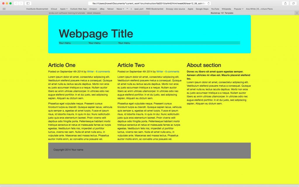
Using media queries supplied with the CSS and HTML of Bootstrap, reformat the supplied content to fit multiple screen sizes. Use the provided content, along with @media CSS to develop appropriate design specifications for each of the common screen resolutions and sizes. Use each different device and/or case use as a starting point.
Part One
Create and link a new style sheet called mediaqueries.css. Use the supplied code to Change background color of each breakpoint to provide evidence of a change of state when the viewport changes. Take a screen shot of each and submit to the dropbox.
body {
}
.container {
}

/*Extra small devices (portrait phones, less than 576px)
No media query for `xs` since this is the default in Bootstrap

Small devices (landscape phones, 576px and up)*/
@media (min-width: 576px) {
}

/* Medium devices (tablets, 768px and up) */
@media (min-width: 768px) {
}

/* Large devices (desktops, 992px and up) */
@media (min-width: 992px) {
}

/* Extra large devices (large desktops, 1200px and up) */
@media (min-width: 1200px) {
}
Sample Layout

Assessment
- The following rubric posted on D2L will determine exercise score: Exercise Grading
Techniques
Mark up, tags, validator, breakpoints, linking, media queries
Materials
computer, web browser, Dreamweaver, content
Deadlines
As defined by corresponding calendar item, dropbox, discussion or content topic description.